
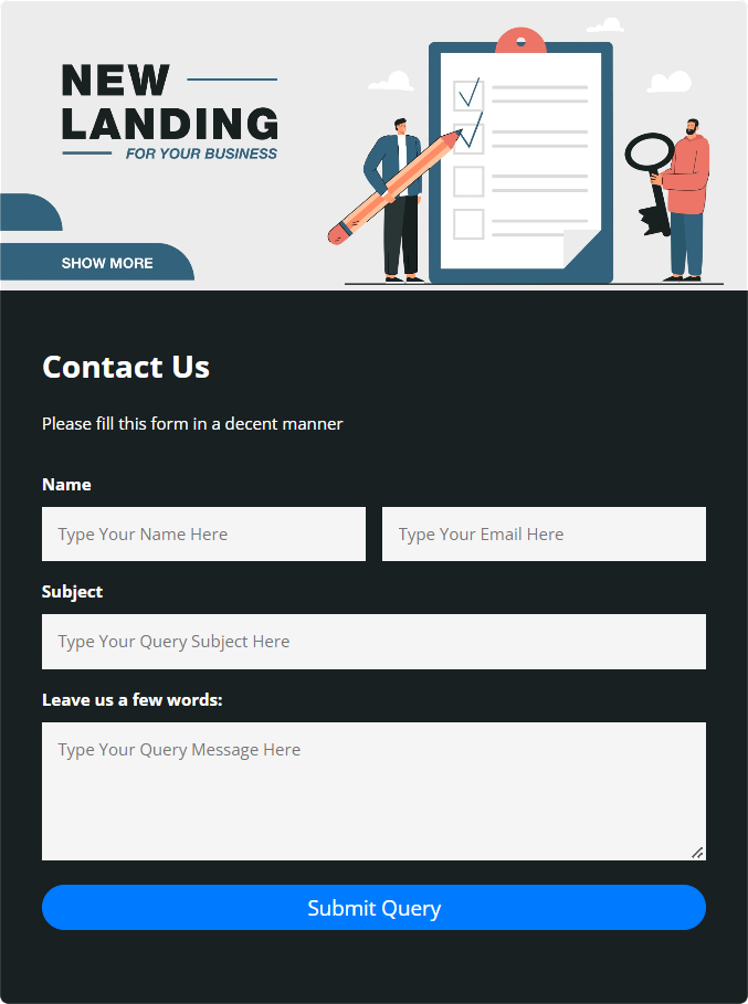
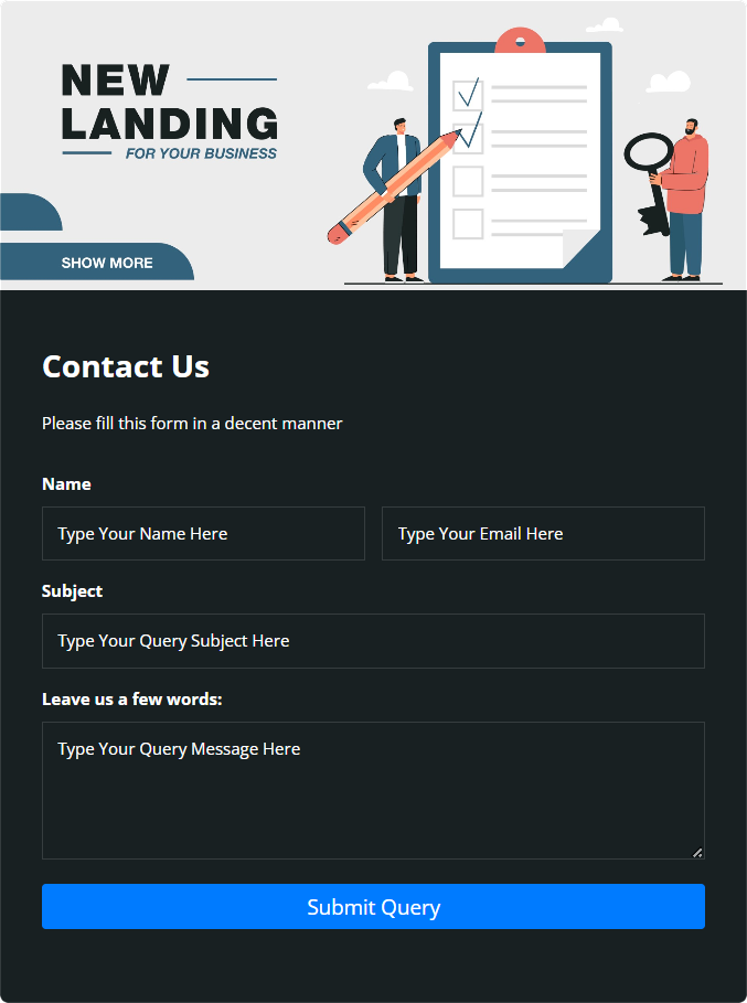
Use Custom CSS
.form-six-header {
  height: 280px !important;
}
.form-six-content input, textarea {
       background-color: whitesmoke !important;
}
button.btn.btn-primary {
    width: -webkit-fill-available;
}
Settings Used
Template Design – 6, Logo URL – None, Logo Size – No Logo, Contact Form Position – Center, Form Background Image – Select Any Image, Contact Form Width-65%, Select Button Design – 1&2,
Used Background Image
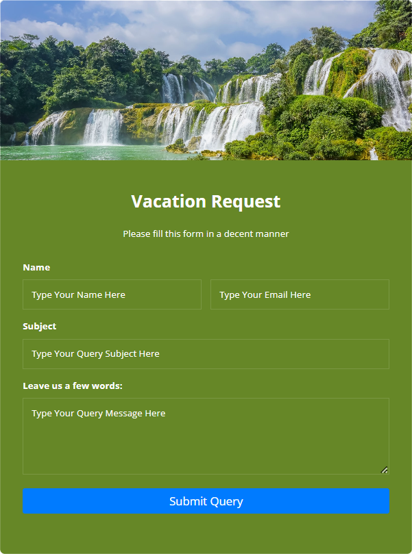
Use Custom CSS
.form-six-header {
  height: 280px !important;
}
form#user-contact-form input::placeholder, textarea#message::placeholder {
    color: white;
}
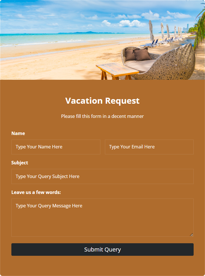
Use Custom CSS
.form-six-header {
  height: 280px !important;
}
form#user-contact-form input::placeholder, textarea#message::placeholder {
    color: white;
}
.form-six-content h2,.form-six-content p {
       text-align: center;
}
Settings Used
Template Design – 6, Logo URL – None, Logo Size – No Logo, Contact Form Position – Center, Form Background Image – Select Any Image, Contact Form Width-65%, Select Button Design – 1&2,
Used Background Image
Use Custom CSS
.form-six-header {
  height: 280px !important;
}
form#user-contact-form input::placeholder, textarea#message::placeholder {
    color: white;
}
.form-six-content h2,.form-six-content p {
       text-align: center;
}
.btn-primary {
    background-color: #23272a  !important;
    border-color: #23272a  !important;
}
.btn-primary:hover {
    background-color: #40464a!important;
    border-color: #40464a!important;
}