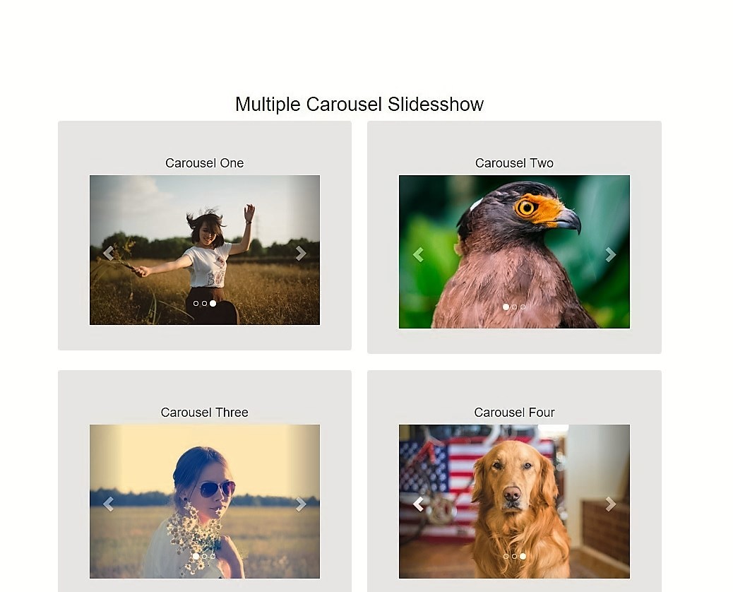
Implementing multiple Bootstrap carousels on a single page is a common requirement for complex landings, but it is also the #1 cause of “carousel collisions”—where interacting with one slider inadvertently triggers another. In 2026, the industry standard has shifted away from jQuery in favor of Bootstrap 5.3+ and Pure JavaScript, which offers faster performance and better accessibility.
Table of Contents
The secret to success is ensuring that every carousel has a distinct, unique ID and that all data attributes precisely reference that ID.
The “Unique ID” Rule
To prevent collisions, every carousel component requires three points of unique identification:
- The Parent Container ID: (e.g.,
id="hero-carousel") - The Indicators Target: (e.g.,
data-bs-target="#hero-carousel") - The Control References: (e.g.,
href="#hero-carousel"ordata-bs-target="#hero-carousel")
High-Efficiency Implementation (Pure JS)
This example demonstrates two independent carousels on a single page using modern Bootstrap 5.3 syntax.
1. HTML Structure
Copy this structure into your HTML. Notice how id="carouselOne" and id="carouselTwo" are used to keep the logic isolated.
<div class="container py-5">
  <div class="row">

    <!-- CAROUSEL ONE -->
    <div class="col-md-6">
      <h3>Product Showcase</h3>
      <div id="carouselOne" class="carousel slide" data-bs-ride="carousel">
        <div class="carousel-inner">
          <div class="carousel-item active"><img src="item1.jpg" class="d-block w-100" alt="..."></div>
          <div class="carousel-item"><img src="item2.jpg" class="d-block w-100" alt="..."></div>
        </div>
        <button class="carousel-control-prev" type="button" data-bs-target="#carouselOne" data-bs-slide="prev">
          <span class="carousel-control-prev-icon"></span>
        </button>
        <button class="carousel-control-next" type="button" data-bs-target="#carouselOne" data-bs-slide="next">
          <span class="carousel-control-next-icon"></span>
        </button>
      </div>
    </div>

    <!-- CAROUSEL TWO -->
    <div class="col-md-6">
      <h3>Client Testimonials</h3>
      <div id="carouselTwo" class="carousel slide" data-bs-ride="carousel">
        <div class="carousel-inner">
          <div class="carousel-item active"><img src="client1.jpg" class="d-block w-100" alt="..."></div>
          <div class="carousel-item"><img src="client2.jpg" class="d-block w-100" alt="..."></div>
        </div>
        <button class="carousel-control-prev" type="button" data-bs-target="#carouselTwo" data-bs-slide="prev">
          <span class="carousel-control-prev-icon"></span>
        </button>
        <button class="carousel-control-next" type="button" data-bs-target="#carouselTwo" data-bs-slide="next">
          <span class="carousel-control-next-icon"></span>
        </button>
      </div>
    </div>

  </div>
</div>
2. Pure JavaScript Initialization (No jQuery)
In 2026, we avoid loading the heavy jQuery library. Use this lightweight script to initialize your sliders with specific intervals:
document.addEventListener("DOMContentLoaded", function() {
  // Initialize First Carousel (Fast cycle)
  const firstCarousel = new bootstrap.Carousel('#carouselOne', {
    interval: 2000,
    touch: true
  });

  // Initialize Second Carousel (Slow cycle)
  const secondCarousel = new bootstrap.Carousel('#carouselTwo', {
    interval: 5000,
    wrap: true
  });
});
Technical Troubleshooting for 2026
1. Data Attribute Migration
If you are updating an older site, ensure you have migrated from data-ride to data-bs-ride and data-target to data-bs-target. Omitting the bs- prefix is the most common reason carousels fail to initialize in modern Bootstrap.
2. Accessibility & ARIA
To meet 2026 accessibility standards, ensure your controls use the type="button" attribute rather than anchor tags (<a>), and include descriptive aria-label tags for screen readers.
3. Image Optimization
For the smoothest transitions, ensure all images within a single carousel have identical aspect ratios. Use the d-block w-100 utility classes to ensure images fill their containers properly.
Summary of Asset Requirements
To keep this implementation “Image-Light,” you only need to ensure you have loaded the official Bootstrap assets correctly in your <head>:
- CSS:
bootstrap.min.css(CDN recommended for 2026 performance). - JS:
bootstrap.bundle.min.js(Includes Popper.js for tooltips/dropdowns). - Images: Your specific slide assets (WebP format recommended).
For a deep dive into advanced carousel customization, check out our guides on Bootstrap JS Library and Modern Web Designing.
By following the “Unique ID” methodology and utilizing Pure JS, you can implement as many carousels as your design requires without ever worrying about component collisions.