An effective logo is relevant, timeless, versatile and memorable. You want people to walk down the street, see your logo and immediately recognize it is your company. Most importantly, you want your logo to stand the test of time so you don’t have to change it every couple of years. After all, in a sea of brands, it is your logo that can help you stand out.
If you’re thinking about establishing a startup, the decision of getting a logo designed may seem like a small one. You may, in fact, want to cross it off your to-do list quickly. As a matter of fact, logos can make a huge impact on the success or failure of your company since these tiny images will be used everywhere – from letterhead to packaging for physical products to iPhone tiles. So look for an affordable logo design company that will not exceed your budget and willlikely do the job perfectly.
Here we have enlisted some of the good, the bad and the ugly logos:
The Good
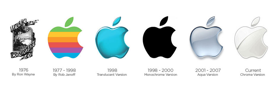
Apple
When we think of the Apple logo today, we think of a simple but sleek design. But it wasn’t always that way. Originally, the logo was extremely complicated. It featured Isaac Newton sitting under the tree, with the famous apple hanging in the air ready to drop on his head and spark his gravity realization. Here Apple conveys very subtly to its audience that like Newton’s ideas, Apple products are also great. The complex logo eventually transformed into a bitten apple silhouette, crossed with the colors of the rainbow. And it has finally changed into the logo we know and love today, representing the values that Apple wants to communicate and associate with their products.
FedEx
Created in 1971, the first FedEx logo went by the full name of Federal Express. The logo showed the words “Federal Express” at a slant, with each word in a different colored area of the logo. The current logo, although is seemingly simplistic, has some depth to it. If you look more closely at the space between the E and X, you will notice a small arrow hidden there, whichsymbolizes FedEx’s speed and accuracy.
The play of color that goes into it is also very clever. An orange “Ex” in logo stands for FedEx express, while a red “Ex” stands for FedEx Freight. It’s astounding how FedEx managed to stuff quite a bit of information and symbolism into a clean and simple logo.

The Bad
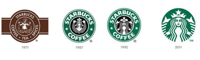
Starbucks
When a brand becomes so widespread and easily recognizable, it becomes fairly easy to simplify its identity. In such cases, eventually the brand name is removed entirely.
The Starbucks logo has always had an image of a twin-tailed mermaid, also known as a siren in Greek mythology, surrounded by the text “Starbucks Coffee”. Like the sirens lured sailors to shipwreck off the coast of an island in the South Pacific, also sometime referred to as Starbuck Island5, the Starbucks coffeelures coffee lovers from everywhere. The original Starbucks logo was complicated but was eventually cleaned out to form the current logo, featuring an enlarged Siren with no stars and wordmark. This was because Starbucks felt it had received enough brand recognition to be published without the company name.
Marketers, however, should remember that no matter how big your company gets, there will always be people who don’t recognize your brand or the brand sentiment behind it. So you need to make it clear to the audience what separates the company from other coffee companies.
CareerBuilder
CareerBuilder’s old logo was fairly simple, condensed wordmark with a nice color scheme. In contrast to that, the new logo is somewhat of a mess of colors, icons, typography styles and conflicting ideas. Truly, CareeBuilder’s rebrand is atrocious.
The Ugly
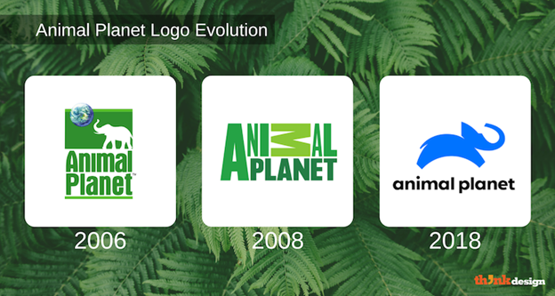
Animal Planet
The new typographic logo of the Animal Planet makes many designers think it can’t get any worse. Animal Planet created a new visual last year to represent their fresh brand identity. The current logo features a somewhat abstract elephant and has an overall minimal outlook with an arbitrary typeface choice. A rebrand of the 1996 logo design, the new design also has an elephant. The elephant, however, which was initially in negative space and was absent in the second logo, has now evolved into a blue creature that looks more like a leaping dog than an elephant. Animal Planet’s new logo lacks everything that can associate the channel to nature, terribly failing to communicate their message across.
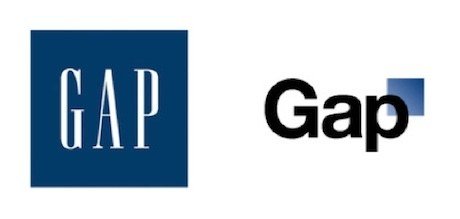
Gap
Back in 2010, GAP decided to rebrand its logo and give it a more modern feel. The company faced a backlash from thousands of enraged customers complaining about the new logo in social media. People went as far as to create a website called “Make your own GAP logo” in which 14,000 new logos were created, making fun of GAP’s re-brand. It was indeed a very humiliating and costly re-brand, which could’ve certainly been avoided. Companies should therefore set up a focus group to see things from their customers’ perspective and consequently make more educated decisions.
.
If you want to experiment with logos yourself and have a shoestring budget, you may even try some logo design websites. Explore ideas to find inspiration, choose the colors and styles you want to represent your business with, and you’re good to go.
Author’s Bio
Loius Martin is a Creative Marketing Manager at Invictus Studio, a custom logo design company in Texas. He has been guest blogging for quite a long time about design, SEO and branding. You can follow him at @loiusmartin1
