WordPress is being used by over 38% of all sites on the web. This implies that WordPress CMS is used to power the majority of personal blogs, periodicals, newspapers, and corporate presentation websites. They employ a variety of site designs, some of which are in line with current design trends. In WordPress design, Minimalist Website Designs is one of the strongest and fastest-growing trends. We’ll go into what minimalism is all about and how to apply this strong trend to your WordPress site.
Modern WordPress Design Approach is Minimalism
The majority of online designs have been influenced by minimalism. The minimalist online design dates back to the early 2000s, and it combines art with human-computer interaction. Minimalism, on the other hand, is defined as “an extreme form of abstract art created in the United States in the 1960s and distinguished by artworks comprised of geometrical shapes based on the squares and the rectangle” on the Tate website. The minimalist design maintains your website’s elements simple, orderly, and in harmony from an aesthetic standpoint. Transitions, general composition, navigation, and other features can be found in popular portfolio WordPress themes and simple WordPress themes, among others.
A simple WordPress design that allows you to do more with less on your website will almost certainly ensure good usability. Minimalism is a current web design strategy based on well-balanced features that emphasize simplicity. Every part in a modular system can be moved around and still look nice and simple. “Simplicity is, ironically, a little more complicated to define in the context of online design,” according to Usability Geek. It’s not just about how a site looks; it’s about how the user interacts with the site as a whole. For a comprehensive understanding of these principles, you can refer to this guide to website design. Your messages and hints will easily lead users if you choose this form of style on your WordPress website.
Minimalist WordPress Design Best Practices
You may simply design a responsive, original, and minimalist website using a WordPress theme and a versatile page builder. Concentrate on what your company is all about and the characteristics that define it. This will ensure that your site is unique and tailored to your needs. In terms of minimalism design, we’ve compiled a list of the best practices you can use on your WordPress website.
1. Negative Space
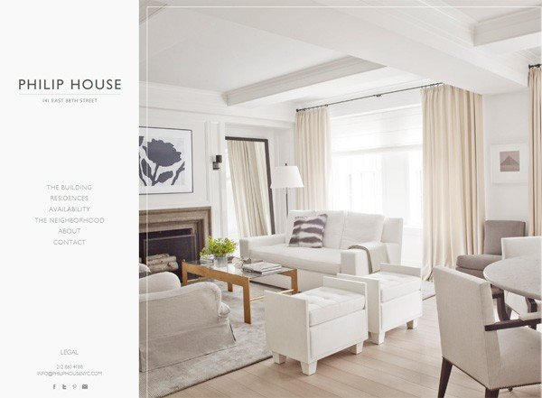
To steer the reader’s experience towards your product/subject of interest, use a lot of negative space between pieces. Furthermore, empty space indicates design balance, which encourages visitors to spend more time on your website. If you’re currently using a page builder, you can accomplish this by adding margins or paddings to builder elements, or by utilizing a spacing module (even Gutenberg includes a simple Spacer option).
2. Hidden Navigation/Hamburger Menu
You’ll get a great UX on your site if you use one of these two menu options. This can have an impact on how your site performs in SERPs and even how many people convert to customers. Instead of focusing on content format, focus on establishing menu items for your topics. To accomplish this impression, many of the best WordPress themes have an off-canvas or overlay menu style.
3. Consistent Coloring
“Color is intelligently used to create visual interest or focus attention in most minimalist interfaces without adding any additional design elements or actual images.” Monochromatic, grayscale, or two accent shades are the most common forms of minimalism in WordPress websites. Color palettes can help you choose the appropriate mix for your website. Even the simplest themes have color pickers built-in via the Live Theme customizer, which you may use to at least add an accent color. Page builders, on the other hand, will provide you more control over your site’s color design; just be sure to select a consistent color palette for your modules.
4. Clear Font Usage
“Effective use of typography can compensate for scant use of pictures and animations, making your website visually appealing,” according to a Medium blog. Fonts establish hierarchy, indicating what is significant to your visitors and assisting them in navigating the sites.” To make the whole page appealing and easy to read, just select the correct combination of font-weight, height, and contrasting colors. Although most themes come with a font selection, it’s simple to load new fonts either manually (with a little code) or with a plugin. Just make sure the number of bespoke typefaces is kept to a minimum (this is a guide to minimalism after all). A body typeface and a heading are usually used together.
5. Concise Details to Emphasize
Each element in a minimalist WordPress web design has a defined function. Consider that each feature serves a specific purpose for your readers. Don’t get carried away with widgets or builder modules. Giving visitors too much to swallow can confuse them, and they will abandon your site before reading all of your valuable stuff. Similarly, be sure that each page on your website has a distinct purpose. There’s no need to include excerpts from blog posts on your about page, for example; adhering to your team or company purpose statement is sufficient.
6. User-friendly and Intuitive Interface
Consider your website to be a map. Visitors enter through the homepage, which leads to other doors (pages, posts, and so on) that provide important and fascinating information. Make use of menus and breadcrumbs (which are usually included in your theme or SEO plugin) to help visitors maintain track of where they are on your site. A well-designed intuitive interface will provide your readers with a pleasant and interactive experience.
7. Responsive Design
Because there are few elements on a minimalist WordPress design, it is easier to make it responsive. The website should run well if there isn’t too much CSS and Javascript. Almost every theme nowadays is responsive. To make the feature work, you don’t have to do anything. If you’re lucky, your theme will also include styling for mobile menus and even unique breakpoints, allowing you to truly customize your website to your needs.
8. Visual Harmony
All of the material on your website should be categorized and divided into parts. Both the visuals and the material must be well-balanced and organized into logical spheres. Color, shape, texture, form, space, line, and value are some of the main categories used to classify elements on a website. You may quickly create the desired layout by dragging and dropping elements with a flexible, yet intuitive theme and page builder (for example, the Total Theme with WPBakery, Newspaper theme with the frontend tagDiv page builder, Divi and Divi builder, and so on). Most popular multipurpose themes include this kind of feature as well.
9. Use of Call-to-Action
CTA buttons are used when you want your visitors to do a certain action (Buy Now, Sign Up, Discover, Read More, or Try It Out). These are call-to-action messages that, when properly implemented, will convert your readers into leads. Make sure the button is clickable and has negative space and contrasting colors around it. Make sure your CTA button is pointing in the appropriate direction. Again, if you’re using a page builder (including Gutenberg), a CTA module should be present. At the very least, you can create your own using a text module and a button.
Tips for Showing Your Content with Minimal Elements.

Minimalist web design is ideal for creating your first website, maintaining a personal blog, or creating a portfolio site for your photography business. This will ensure that your material captures the attention of all readers. Let’s have a look at the elements that must be included in your overall website design:
- All elements, including colors and backgrounds, should serve a practical purpose. Simply keep things clean and tidy, and eliminate clutter.
- Use photos from your own collection of stock images from reputable sources that are related to the material being presented. Use them sparingly, just when they’re absolutely important to emphasize the article’s/main page’s points.
- The most important content should always be at the top of the page. Use a contrasting color or an elegant box to draw attention to this part.
- Make use of legible fonts.
- You could make content blocks out of your authored pieces.
Recommended Minimalist Portfolio Theme – Minimalio

It’s a clean, lightweight WordPress theme designed specifically for creators who want their work to speak for itself. The layout is intentionally minimal, with just the right amount of design to make your projects shine—no distractions, no fluff. It is very easy to set up. You don’t need to wrestle with complicated page builders or overloaded theme settings. It works beautifully out of the box, and it’s fully compatible with Gutenberg for fast, intuitive editing.
If you’re a designer, photographer, or anyone building a personal portfolio, Minimalio gives you exactly what you need—and nothing you don’t. It’s a great example of how minimalist design can still be powerful. You can find more at minimalio.com.
How Minimalism Impacts Your Business

If you live a minimalistic lifestyle and have a personal travel blog, you’ll most certainly strive to incorporate the design trend into your website. Another case in point is your company. With this design style, you’ll get the most out of your information if you can show it in a basic approach. There’s a link between minimalist design and a minimalist lifestyle.
Your firm will gain if you’ve clearly defined your objectives and set a visual hierarchy on your website. People who like your material will want to see more of it and receive more of it. Minimalism is synonymous with functionality. A simple web design adds value to your content, and a fully functional website is a recipe for commercial success.
Conclusion
Your viewers will be grateful if you choose a simple WordPress design for your website. A minimalist website is much easier to navigate than others, and the negative space draws attention to key features. Your visitors will stay longer, maybe converting from leads to sales (if this is what you want to achieve with your site). Everything is due to your site’s structure, intuitive UI, and the way elements are organized to give the most immersive user experience possible.
If you want to make your WordPress site look professional and lovely, you should definitely look into the minimalist design and best practices.